---
title: "CE4 - Dashboard COVID-19"
output:
flexdashboard::flex_dashboard:
orientation: columns
vertical_layout: fill
source_code: embed
social: menu
theme: cosmo
self_contained: FALSE
fig_mobile: TRUE
---
```{r imports, include=FALSE}
source('_scripts/import.R', echo = TRUE) # Importa librerias, bases de datos, variables globales y funciones.
```
```{r plotly, message=F, warning=F, include =F}
source('_scripts/infobutton.R', echo = TRUE, encoding="UTF-8") # Importa las variables para los botones información
source('_scripts/plotly.R', echo = TRUE, encoding="UTF-8") # Importa configuraciones para los gráficos en plotly
source('_scripts/leaflet.R', echo = TRUE) # Importa configuraciones para los gráficos en plotly
```
```{r deps, message=F, warning=F, include=FALSE}
source('_scripts/cleaning.R', echo = TRUE, encoding="UTF-8") # Importa las bases a utilizar procesadas.
```
```{r, message=F, warning=F}
vars.pmav.new <- dep %>%
dplyr::select(dat,dep,mav.pos.new.hab) %>%
dplyr::filter(dat == c.date) %>%
dplyr::arrange(dplyr::desc(mav.pos.new.hab)) %>%
dplyr::select(dep) %>%
dplyr::mutate(dep = ifelse(dep=="LA LIBERTAD","LA_LIBERTAD",
ifelse(dep=="MADRE DE DIOS","MADRE_DE_DIOS",
ifelse(dep=="SAN MARTIN","SAN_MARTIN",dep))))%>%
.$dep
vars.mav.new <- dep %>%
dplyr::select(dat,dep,mav.pos.new) %>%
dplyr::filter(dat == c.date) %>%
dplyr::arrange(dplyr::desc(mav.pos.new)) %>%
dplyr::select(dep) %>%
dplyr::mutate(dep = ifelse(dep=="LA LIBERTAD","LA_LIBERTAD",
ifelse(dep=="MADRE DE DIOS","MADRE_DE_DIOS",
ifelse(dep=="SAN MARTIN","SAN_MARTIN",dep))))%>%
.$dep
last.mav.new <- vars.mav.new[length(vars.mav.new)]
vars.pos <- dep %>%
dplyr::select(dat,dep,pos) %>%
dplyr::filter(dat == c.date) %>%
dplyr::arrange(dplyr::desc(pos)) %>%
dplyr::select(dep) %>%
dplyr::mutate(dep = ifelse(dep=="LA LIBERTAD","LA_LIBERTAD",
ifelse(dep=="MADRE DE DIOS","MADRE_DE_DIOS",
ifelse(dep=="SAN MARTIN","SAN_MARTIN",dep))))%>%
.$dep
last.pos <- vars.pos[length(vars.pos)]
vars_latam_mav <- LATAM %>%
dplyr::select(date,location,mav_new) %>%
dplyr::filter(date == c.date) %>%
dplyr::summarise(max = as.numeric(max(mav_new)))%>%
dplyr::arrange(dplyr::desc(max)) %>%
dplyr::select(location)%>%
.$location
```
Nacional {.bg}
=====================================
Column 1 {.tabset data-width=350}
-------------------------------------
### Casos
```{r}
# line_types <- list(
# type = "dropdown",
# direction = "down",
# xanchor = 'center',
# yanchor = "top",
# bgcolor = "white",
# pad = list('r'= 0, 't'= 10, 'b' = 10),
# x = 0.6,
# y = 1,
# buttons = list(
#
# list(label ="Hitos",
# method = "update",
# args = list(list(visible=c(T,F)))),
# list(label ="Duplicación",
# method = "update",
# args = list(list(visible=c(F,T))))
# )
# )
#
# a <- plot_mapbox()%>%
# add_sf(data=c.dep,
# color = ~pos.hab,
# split = ~dep,
# colors = palette_1,
# alpha = 1,
# showlegend = F,
# stroke = I("black")
# ) %>%
# layout(mapbox = list(style = "carto-darkmatter",
# accesstoken = token,
# zoom=6),
# updatemenus = list(line_types)) %>%
# plotly_layout_map() %>%
# plotly_config(infobutton_1_2)%>%
# plotly_end()
#
# a
c.dep.geo <-rjson::fromJSON(sf_geojson(c.dep))
map_types <- list(
type = "dropdown",
direction = "down",
xanchor = 'center',
yanchor = "top",
bgcolor = "white",
pad = list('r'= 0, 't'= 10, 'b' = 10),
x = 0.2,
y = 0.95,
buttons = list(
list(label ="Totales",
method = "update",
args = list(list(visible=c(T,F)))),
list(label ="Por 100 mil hab.",
method = "update",
args = list(list(visible=c(F,T))))
)
)
annot <- list(list(text = "Casos acumulados",font=list(color="white"),
x=0.2, y=0.965,
xref='paper', yref='paper', showarrow=FALSE,
xanchor="center",yanchor="top"))
plot_ly(marker=list(line=list(width=1, color="black")),
colors=palette_1#colorscale differs colores ligeramente
)%>%
add_trace(z=log(c.dep$pos),
type="choroplethmapbox",geojson=c.dep.geo,locations=c.dep$dep,featureidkey="properties.dep",
zmin=min(log(c.dep$pos)),zmax=max(log(c.dep$pos)),
colorbar= list(thicknes=20,
len = 0.35,
x=0.05,
y=0.35,
autotick=F,
tick0=0,tickcolor="white",
tickfont= list(color="white"),
tickmode="array",
tickvals=c(min(log(c.dep$pos)),max(log(c.dep$pos))*0.2,
max(log(c.dep$pos))*0.4,max(log(c.dep$pos))*0.6,
max(log(c.dep$pos))*0.8,max(log(c.dep$pos))),
ticktext= c("0","10","100","1,000","10,000","100,000+")
),
hoverinfo="text",
text = paste(c.dep$dep,'
Casos acumulados:',c.dep$pos,"")
)%>%
add_trace(z=c.dep$pos.hab,
type="choroplethmapbox",geojson=c.dep.geo,locations=c.dep$dep,featureidkey="properties.dep",
zmin=0,zmax=max(c.dep$pos.hab),
visible=F,
colorbar=plotly_colorbar_map,
hoverinfo="text",
text = paste(c.dep$dep,'
Casos acumulados:',c.dep$pos,"")
) %>% layout(
mapbox=list(
style="carto-darkmatter",
zoom =4.85,
center=list(lon=-75.51,lat= -9.70)),
updatemenus = list(map_types),
annotations=annot
)%>%
plotly_layout_map() %>%
plotly_config(infobutton_casos)%>%
plotly_end()
```
### Casos nuevos
```{r}
map_types <- list(
type = "dropdown",
direction = "down",
xanchor = 'center',
yanchor = "top",
bgcolor = "white",
pad = list('r'= 0, 't'= 10, 'b' = 10),
x = 0.2,
y = 0.95,
buttons = list(
list(label ="Totales",
method = "update",
args = list(list(visible=c(T,F)))),
list(label ="Por 100 mil hab.",
method = "update",
args = list(list(visible=c(F,T))))
)
)
annot <- list(list(text = "Casos nuevos",font=list(color="white"),
x=0.2, y=0.965,
xref='paper', yref='paper', showarrow=FALSE,
xanchor="center",yanchor="top"))
plot_ly(marker=list(line=list(width=1, color="black")),
colors=palette_1#colorscale differs colores ligeramente
)%>%
add_trace(z=c.dep$pos.new.log,
type="choroplethmapbox",geojson=c.dep.geo,locations=c.dep$dep,featureidkey="properties.dep",
zmin=0,zmax=max(c.dep$pos.new.log),
colorbar= list(thicknes=20,
len = 0.35,
x=0.05,
y=0.35,
autotick=F,
tick0=0,tickcolor="white",
tickfont= list(color="white"),
tickmode="array",
tickvals=c(min(c.dep$pos.new.log),max(c.dep$pos.new.log)*0.25,
max(c.dep$pos.new.log)*0.5,max(c.dep$pos.new.log)*0.75,
max(c.dep$pos.new.log)),
ticktext= c("0","1","10","100","1,000+")),
hoverinfo="text",
text = paste(c.dep$dep,'
Casos nuevos:',c.dep$pos.new,"")
)%>%
add_trace(z=c.dep$pos.new.hab,
type="choroplethmapbox",geojson=c.dep.geo,locations=c.dep$dep,featureidkey="properties.dep",
zmin=0,zmax=max(c.dep$pos.new.hab),
visible=F,
colorbar=plotly_colorbar_map,
hoverinfo="text",
text = paste(c.dep$dep,'
Casos nuevos:',round(c.dep$pos.new.hab,0),"")
) %>% layout(
mapbox=list(
style="carto-darkmatter",
zoom =4.85,
center=list(lon=-75.51,lat= -9.70)),
updatemenus = list(map_types),
annotations=annot
)%>%
plotly_layout_map() %>%
plotly_config(infobutton_casos_nuevos)%>%
plotly_end()
```
### Fallecidos
```{r}
map_types <- list(
type = "dropdown",
direction = "down",
xanchor = 'center',
yanchor = "top",
bgcolor = "white",
pad = list('r'= 0, 't'= 10, 'b' = 10),
x = 0.2,
y = 0.95,
buttons = list(
list(label ="Totales",
method = "update",
args = list(list(visible=c(T,F)))),
list(label ="Por 100 mil hab.",
method = "update",
args = list(list(visible=c(F,T))))
)
)
annot <- list(list(text = "Fallecidos acumulados",font=list(color="white"),
x=0.2, y=0.965,
xref='paper', yref='paper', showarrow=FALSE,
xanchor="center",yanchor="top"))
plot_ly(marker=list(line=list(width=1, color="black")),
colors=palette_1#colorscale differs colores ligeramente
)%>%
add_trace(z=log(c.dep$pas),
type="choroplethmapbox",geojson=c.dep.geo,locations=c.dep$dep,featureidkey="properties.dep",
zmin=min(log(c.dep$pas)),zmax=max(log(c.dep$pas)),
colorbar= list(thicknes=20,
len = 0.35,
x=0.05,
y=0.35,
autotick=F,
tick0=0,tickcolor="white",
tickfont= list(color="white"),
tickmode="array",
tickvals=c(min(log(c.dep$pas)),max(log(c.dep$pas))*0.33,
max(log(c.dep$pas))*0.66,
max(log(c.dep$pas))),
ticktext= c("0","10","100","1,000+")),
hoverinfo="text",
text = paste(c.dep$dep,'
Fallecidos acumulados:',c.dep$pas,"")
)%>%
add_trace(z=c.dep$pas.hab,
type="choroplethmapbox",geojson=c.dep.geo,locations=c.dep$dep,featureidkey="properties.dep",
zmin=0,zmax=max(c.dep$pas.hab),
visible=F,
colorbar=plotly_colorbar_map,
hoverinfo="text",
text = paste(c.dep$dep,'
Fallecidos acumulados:',round(c.dep$pas.hab,0),"")
) %>% layout(
mapbox=list(
style="carto-darkmatter",
zoom =4.85,
center=list(lon=-75.51,lat= -9.70)),
updatemenus = list(map_types),
annotations=annot
)%>%
plotly_layout_map() %>%
plotly_config(infobutton_fallecidos)%>%
plotly_end()
```
### Fallecidos nuevos
```{r}
map_types <- list(
type = "dropdown",
direction = "down",
xanchor = 'center',
yanchor = "top",
bgcolor = "white",
pad = list('r'= 0, 't'= 10, 'b' = 10),
x = 0.2,
y = 0.95,
buttons = list(
list(label ="Totales",
method = "update",
args = list(list(visible=c(T,F)))),
list(label ="Por 100 mil hab.",
method = "update",
args = list(list(visible=c(F,T))))
)
)
annot <- list(list(text = "Fallecidos nuevos",font=list(color="white"),
x=0.2, y=0.965,
xref='paper', yref='paper', showarrow=FALSE,
xanchor="center",yanchor="top"))
plot_ly(marker=list(line=list(width=1, color="black")),
colors=palette_1#colorscale differs colores ligeramente
)%>%
add_trace(z=c.dep$pas.new.log,
type="choroplethmapbox",geojson=c.dep.geo,locations=c.dep$dep,featureidkey="properties.dep",
zmin=min(c.dep$pas.new.log),zmax=max(c.dep$pas.new.log),
colors=palette_log,
colorbar= list(thicknes=20,
len = 0.35,
x=0.05,
y=0.35,
autotick=F,
tick0=0,tickcolor="white",
tickfont= list(color="white"),
tickmode="array",
tickvals=c(min(c.dep$pas.new.log),
max(c.dep$pas.new.log)*0.5,
max(c.dep$pas.new.log)),
ticktext= c("0","10","100+")),
hoverinfo="text",
text = paste(c.dep$dep,'
Fallecidos nuevos:',c.dep$pas.new,"")
)%>%
add_trace(z=c.dep$pas.new.hab,
type="choroplethmapbox",geojson=c.dep.geo,locations=c.dep$dep,featureidkey="properties.dep",
zmin=0,zmax=max(c.dep$pas.new.hab),
visible=F,
colorbar=plotly_colorbar_map,
hoverinfo="text",
text = paste(c.dep$dep,'
Fallecidos nuevos:',round(c.dep$pas.new.hab,2),"")
) %>% layout(
mapbox=list(
style="carto-darkmatter",
zoom =4.85,
center=list(lon=-75.51,lat= -9.70)),
updatemenus = list(map_types),
annotations=annot
)%>%
plotly_layout_map() %>%
plotly_config(infobutton_fallecidos_nuevos)%>%
plotly_end()
```
### Pruebas
```{r}
map_types <- list(
type = "dropdown",
direction = "down",
xanchor = 'center',
yanchor = "top",
bgcolor = "white",
pad = list('r'= 0, 't'= 10, 'b' = 10),
x = 0.2,
y = 0.95,
buttons = list(
list(label ="Totales",
method = "update",
args = list(list(visible=c(T,F)))),
list(label ="Por 100 mil hab.",
method = "update",
args = list(list(visible=c(F,T))))
)
)
annot <- list(list(text = "Pruebas acumuladas",font=list(color="white"),
x=0.2, y=0.965,
xref='paper', yref='paper', showarrow=FALSE,
xanchor="center",yanchor="top"))
plot_ly(marker=list(line=list(width=1, color="black")),
colors=palette_1#colorscale differs colores ligeramente
)%>%
add_trace(z=log(c.dep$smp),
type="choroplethmapbox",geojson=c.dep.geo,locations=c.dep$dep,featureidkey="properties.dep",
zmin=min(log(c.dep$smp)),zmax=max(log(c.dep$smp)),
colorbar= list(thicknes=20,
len = 0.35,
x=0.05,
y=0.35,
autotick=F,
tick0=0,tickcolor="white",
tickfont= list(color="white"),
tickmode="array",
tickvals=c(min(log(c.dep$smp)),max(log(c.dep$smp))*0.2,
max(log(c.dep$smp))*0.4,max(log(c.dep$smp))*0.6,
max(log(c.dep$smp))*0.8,max(log(c.dep$smp))),
ticktext= c("0","10","100","1,000","10,000","100,000+")),
hoverinfo="text",
text = paste(c.dep$dep,'
Pruebas acumuladas:',c.dep$smp,"")
)%>%
add_trace(z=c.dep$smp.hab,
type="choroplethmapbox",geojson=c.dep.geo,locations=c.dep$dep,featureidkey="properties.dep",
zmin=0,zmax=max(c.dep$smp.hab),
visible=F,
colorbar=plotly_colorbar_map,
hoverinfo="text",
text = paste(c.dep$dep,'
Pruebas acumuladas:',round(c.dep$smp.hab,0),"")
) %>% layout(
mapbox=list(
style="carto-darkmatter",
zoom =4.85,
center=list(lon=-75.51,lat= -9.70)),
updatemenus = list(map_types),
annotations=annot
)%>%
plotly_layout_map() %>%
plotly_config(infobutton_pruebas)%>%
plotly_end()
```
### Pruebas Nuevas
```{r}
map_types <- list(
type = "dropdown",
direction = "down",
xanchor = 'center',
yanchor = "top",
bgcolor = "white",
pad = list('r'= 0, 't'= 10, 'b' = 10),
x = 0.2,
y = 0.95,
buttons = list(
list(label ="Totales",
method = "update",
args = list(list(visible=c(T,F,F)))),
list(label ="Por 100 mil hab.",
method = "update",
args = list(list(visible=c(F,T,F)))),
list(label ="Tasa positivos",
method = "update",
args = list(list(visible=c(F,F,T))))
)
)
annot <- list(list(text = "Pruebas nuevas",font=list(color="white"),
x=0.2, y=0.965,
xref='paper', yref='paper', showarrow=FALSE,
xanchor="center",yanchor="top"))
plot_ly(marker=list(line=list(width=1, color="black")),
colors=palette_1#colorscale differs colores ligeramente
)%>%
add_trace(z=log(c.dep$smp.new),
type="choroplethmapbox",geojson=c.dep.geo,locations=c.dep$dep,featureidkey="properties.dep",
zmin=min(log(c.dep$smp.new)),zmax=max(log(c.dep$smp.new)),
colorbar= list(thicknes=20,
len = 0.35,
x=0.05,
y=0.35,
autotick=F,
tick0=0,tickcolor="white",
tickfont= list(color="white"),
tickmode="array",
tickvals=c(min(log(c.dep$smp.new)),max(log(c.dep$smp.new))*0.25,
max(log(c.dep$smp.new))*0.5,max(log(c.dep$smp.new))*0.75,
max(log(c.dep$smp.new))),
ticktext= c("0","10","100","1,000","10,000+")),
hoverinfo="text",
text = paste(c.dep$dep,'
Pruebas nuevas:',c.dep$smp.new,"")
)%>%
add_trace(z=c.dep$smp.new.hab,
type="choroplethmapbox",geojson=c.dep.geo,locations=c.dep$dep,featureidkey="properties.dep",
zmin=0,zmax=max(c.dep$smp.new.hab),
visible=F,
colorbar=plotly_colorbar_map,
hoverinfo="text",
text = paste(c.dep$dep,'
Pruebas nuevas:',round(c.dep$smp.new.hab,2),"")
)%>%
add_trace(z=c.dep$ratio.new*100,
type="choroplethmapbox",geojson=c.dep.geo,locations=c.dep$dep,featureidkey="properties.dep",
zmin=0,zmax=max(c.dep$ratio.new*100),
visible=F,
colorbar=plotly_colorbar_map,
hoverinfo="text",
text = paste(c.dep$dep,'
Tasa de positivos:',round(c.dep$ratio.new,2)*100,"%","")
) %>% layout(
mapbox=list(
style="carto-darkmatter",
zoom =4.85,
center=list(lon=-75.51,lat= -9.70)),
updatemenus = list(map_types),
annotations=annot
)%>%
plotly_layout_map() %>%
plotly_config(infobutton_pruebas_nuevas)%>%
plotly_end()
```
Column 2 {.tabset data-width=400 vertical_layout=scroll}
-------------------------------------
### Casos acumulados
```{r}
fig <- nac %>%
plot_ly() %>%
add_trace(x = ~dat, y = ~pos.new,
type = 'bar', name = 'Casos nuevos',
marker = list(color = '#006b7d'),
text = paste(nac$days.end, "días desde hoy"),
hovertemplate = paste('Fecha: %{x}',
'
Nuevos Casos: %{y}',
'%{text}'))%>%
add_trace(x = ~dat, y = ~pos,
type = 'scatter',
mode = 'lines+markers',
name = 'Casos acumulados',
yaxis = 'y2',
line = list(color = '#ffa600'),
marker = list(color = '#ffa600'),
text = paste(nac$days.end, "días desde hoy"),
hovertemplate = ~paste('Fecha: %{x}',
"
Casos Acumulados: %{y:.0f}",
'%{text}')) %>%
add_segments(x = "2020-04-08", xend = "2020-04-08",
y = 0, yend=max(nac$pos.new),
text="2020-04-08",name="Inicio de Pruebas Rápidas",
hovertemplate = paste('%{text}'),
legendgroup = 'group2',
line = list(color = "#7aa82a",
width = 4,
dash = "dot")
) %>%
add_segments(x = "2020-06-01", xend = "2020-06-01",
y = 0, yend=max(nac$pos.new)+100,
text="2020-06-01",name="Cambio en conteo",
hovertemplate = paste('%{text}'),
legendgroup = 'group2',
line = list(color = "#389e4e",
width = 4,
dash = "solid")
) %>%
add_trace(x = ~dat, y = ~dup.3,
type = 'scatter',
mode = 'lines',
name = 'Tres días',
line = list(color = '#7aa82a',
dash = "dash",
width=3.5),
text = "Casos se duplican en tres (3) días",
hoverinfo = "text",
visible=F,
yaxis = 'y2') %>%
add_trace(x = ~dat, y = ~dup.4,
type = 'scatter',
mode = 'lines',
name = 'Cuatro días',
line = list(color = '#389e4e',
dash = "dash",
width=3.5),
text = "Casos se duplican en cuatro (4) días",
hoverinfo = "text",
visible=F,
yaxis = 'y2')
chart_types <- list(
type = "dropdown",
direction = "down",
xanchor = 'center',
bgcolor = "white",
yanchor = "top",
pad = list('r'= 0, 't'= 10, 'b' = 10),
x = 0.4,
y = 1,
buttons = list(
list(method = "relayout",
args = list(list(yaxis2 = list(side = 'right', overlaying = "y",
title = 'Casos acumulados por día (lineal)',
showgrid = F, zeroline = F,
color = "#ffd29f",
range=list(0, roundUpNice(max(nac$pos))),
autotick=F,
tick0=0,
dtick=roundUpNice(max(nac$pos))/5,
fixedrange=T))),
label = "Lineal"),
list(method = "relayout",
args = list(list(yaxis2 = list(side = 'right', overlaying = "y", type = "log",
title = 'Casos acumulados (logaritmica)',
showgrid = F, zeroline = F,
color = "#ffd29f",
range=list(1, 6),
autotick=F,
tick0=0,
fixedrange=T))),
label = "Logaritmica")
))
line_types <- list(
type = "dropdown",
direction = "down",
xanchor = 'center',
yanchor = "top",
bgcolor = "white",
pad = list('r'= 0, 't'= 10, 'b' = 10),
x = 0.6,
y = 1,
buttons = list(
list(label ="Hitos",
method = "update",
args = list(list(visible=c(T,T,T,T,F,F)))),
list(label ="Duplicación",
method = "update",
args = list(list(visible=c(T,T,F,F,T,T))))
)
)
annot <- list(list(text = "Tipo de Gráfico",font=list(color="white"),
x=0.4, y=1.02,
xref='paper', yref='paper', showarrow=FALSE,
xanchor="center",yanchor="top"),
list(text = "Adicionales",font=list(color="white"),
x=0.6, y=1.02,
xref='paper', yref='paper', showarrow=FALSE,
xanchor="center",yanchor="top"))
fig %>% layout(title = 'Casos acumulados y nuevos - Perú',
titlefont=list(color="white"),
xaxis = list(title = "Fecha de reporte",
color ="white",
tickformat= "%d-%b"),
yaxis = list(side = 'left', title = 'Casos nuevos por día',
showgrid = T, gridcolor = "#818181", zeroline = F,
color = "#98cbe1",
range=list(0, roundUpNice(max(nac$pos.new))),
autotick=F,
tick0=0,
dtick=roundUpNice(max(nac$pos.new))/5,
fixedrange=T),
yaxis2 = list(side = 'right', overlaying = "y",
title = 'Casos acumulados por día (lineal)',
showgrid = F, zeroline = F,
color = "#ffd29f",
range=list(0, roundUpNice(max(nac$pos))),
autotick=F,
tick0=0,
dtick=roundUpNice(max(nac$pos))/5,
fixedrange=T),
legend = list(orientation = "h",
xanchor = "center",
yanchor = "bottom",
x = 0.5,
y = -0.16,
font = list(color = "white")),
updatemenus = list(chart_types,line_types),
annotations = annot) %>%
plotly_layout() %>%
plotly_config(infobutton_1_2) %>%
plotly_end()
```
### Casos nuevos
```{r, message=F, warning=F}
plot_ly(nac) %>%
add_trace(x = ~dat, y = ~pos.new,
type = 'bar', name = 'Casos nuevos',
marker = list(color = '#006b7d'),
text = paste(nac$days.end, "días desde hoy"),
hovertemplate = paste('Fecha: %{x}',
'
Nuevos Casos: %{y}',
'%{text}'))%>%
add_trace(x = ~dat, y = ~nac$mav.pos.new,
type = 'scatter',
mode = 'lines+markers',
name = 'Media Móvil',
line = list(color = '#ffa600'),
marker = list(color = '#ffa600'),
text = paste(nac$days.end, "días desde hoy"),
hovertemplate = ~paste('Fecha: %{x}',
"
Media móvil: %{y:.0f}",
'%{text}')) %>%
add_segments(x = "2020-04-08", xend = "2020-04-08",
y = 0, yend=max(nac$pos.new),
text="2020-04-08",name="Inicio de Pruebas Rápidas",
hovertemplate = paste('%{text}'),
legendgroup = 'group2',
line = list(color = "#7aa82a",
width = 4,
dash = "dot")
)%>%
add_segments(x = "2020-06-01", xend = "2020-06-01",
y = 0, yend=max(nac$pos.new)+100,
text="2020-06-01",name="Cambio en conteo",
hovertemplate = paste('%{text}'),
legendgroup = 'group2',
line = list(color = "#389e4e",
width = 4,
dash = "solid")
)%>%
layout(title = '
Media móvil de casos nuevos por día - Perú(Media móvil de 7 días)',
titlefont=list(color="white"),
xaxis = list(title = "Fecha de reporte",
color="white",
tickformat= "%d-%b"),
yaxis = list(side = 'left', title = 'Casos nuevos por día',
showgrid = T, gridcolor = "#818181", zeroline = F,
color = "white",
range=list(0, roundUpNice(max(nac$pos.new))),
autotick=F,
tick0=0,
dtick=roundUpNice(max(nac$pos.new))/5),
yaxis2 = list(side = 'right', overlaying = "y",
title = 'Media móvil de casos nuevos - 7 días (lineal)',
showgrid = FALSE, zeroline = FALSE,
color="#ffa600",
range = c(min(0),
max(nac$pos.new))),
legend = list(orientation = "h",
xanchor = "center",
yanchor = "bottom",
x = 0.5,
y = -0.16,
font = list(color = "white"))
) %>%
plotly_layout() %>%
plotly_config(infobutton_3) %>%
plotly_end()
```
### Casos según estado
```{r, message=F, warning=F}
plot_ly(nac_2, x = ~Dia) %>%
add_trace( y = ~Fallecidos, name = 'Fallecidos',
type = 'scatter', mode = 'lines+markers',
marker = list(color = 'rgba(0,0,0,0)'),
line = list(color = '#ffa600'),
stackgroup = 'one', fillcolor = '#ffa600') %>%
add_trace(y = ~Recuperados,
name = 'Recuperados', fillcolor = '#7aa82a',
marker = list(color = '#7aa82a'),
line = list(color = '#7aa82a'),
stackgroup = 'one') %>%
add_trace(y = ~Activos,
name = 'Activos', mode = 'none',
fillcolor = '#035871',
marker = list(color = '#0e5871'),
line = list(color = '#0e5871'),
stackgroup = 'one') %>%
layout(title ="Casos según su estado",
titlefont=list(color="white"),
xaxis = list(title = "Fecha de reporte",
showgrid = FALSE,
color ="white"),
yaxis = list(title = "Número de casos según estado",
showgrid = FALSE,
color ="white"),
legend = list(orientation = "h",
xanchor = "center",
yanchor = "bottom",
x = 0.5,
y = -0.125,
font = list(color = "white"))
) %>%
plotly_layout () %>%
plotly_config(infobutton_5) %>%
plotly_end()
```
### Proporción según estado
```{r, message=F, warning=F}
plot_ly(nac_2, x = ~Dia, y = ~per_fallecidos, name = 'Fallecidos',
type = 'scatter', mode = 'lines+markers', stackgroup = 'one',
groupnorm = 'percent', fillcolor = '#ffa600',
marker = list(color = 'rgba(0,0,0,0)'),
line = list(color = '#bbac00'),
hovertemplate = ~paste('Fecha: %{x}',
"
Fallecidos: %{y:.2f}%"))%>%
add_trace(y = ~per_recuperados,
name = 'Recuperados', fillcolor = '#7aa82a',
marker = list(color = 'rgba(0,0,0,0)'),
line = list(color = '#7aa82a'),
hovertemplate = ~paste('Fecha: %{x}',
"
Casos Recuperados: %{y:.2f}%")) %>%
add_trace(y = ~per_activos,
name = 'Activos', mode = 'none',
fillcolor = '#035871',
marker = list(color = 'rgba(0,0,0,0)'),
line = list(color = 'rgba(0,0,0,0)'),
hovertemplate = ~paste('Fecha: %{x}',
"
Casos Activos: %{y:.2f}%")) %>%
layout(title ="Proporción de casos según estado",
titlefont=list(color="white"),
shapes = list(
list(
type = "line",
x0 = 0, x1 = 1,
xref = "paper",
y0 = 50, y1 = 50,
line = list(color = "white",
dash = "dash")
),
list(
type = "line",
x0 = 0, x1 = 1,
xref = "paper",
y0 = 25, y1 = 25,
line = list(color = "white",
dash = "dot")
),
list(
type = "line",
x0 = 0, x1 = 1,
xref = "paper",
y0 = 75, y1 = 75,
line = list(color = "white",
dash = "dot")
)
),
xaxis = list(title = "Fecha de reporte",
showgrid = FALSE,
color ="white"),
yaxis = list(title = "Proporción de casos según estado",
showgrid = FALSE,
ticksuffix = '%',
color ="white"),
legend = list(orientation = "h",
xanchor = "center",
yanchor = "bottom",
x = 0.5,
y = -0.125,
font = list(color = "white"))
) %>%
plotly_layout () %>%
plotly_config(infobutton_6) %>%
plotly_end()
```
### Pruebas realizadas
```{r, message=F, warning=F}
plot_ly(nac, x = ~dat) %>%
add_trace(y = ~smp.neg.new, type = 'bar',
name = 'Negativos',
legendgroup = 'group2',
marker = list(color = '#006b7d'),
hovertemplate = ~paste('Fecha: %{x}',
"
Pruebas negativas: %{y:.0f}")) %>%
add_trace(y = ~pos.new, type = 'bar',
name = 'Positivos',
legendgroup = 'group2',
marker = list(color = '#389e4e'),
hovertemplate = ~paste('Fecha: %{x}',
"
Pruebas positivas: %{y:.0f}")) %>%
add_trace(y = ~mav.pos.new,
type = 'scatter',
mode = 'lines+markers',
name = 'Media móvil',
yaxis = 'y2',
line = list(color = '#ffa600'),
marker = list(color = '#ffa600'),
text = paste(nac$days.end, "días desde hoy"),
hovertemplate = ~paste('Fecha: %{x}',
"
Casos nuevos (media móvil): %{y:.0f}",
'%{text}'))%>%
add_segments(x = "2020-04-08", xend = "2020-04-08",
y = 0, yend=max(nac$smp),
text="2020-04-08",name="Inicio de Pruebas Rápidas",
hovertemplate = paste('%{text}'),
legendgroup = 'group3',
line = list(color = "#7aa82a",
width = 4,
dash = "dot")
)%>%
add_segments(x = "2020-06-01", xend = "2020-06-01",
y = 0, yend=max(nac$smp)+100,
text="2020-06-01",name="Cambio en conteo",
hovertemplate = paste('%{text}'),
legendgroup = 'group3',
line = list(color = "#bbac00",
width = 4,
dash = "solid")
)%>%
layout(title = 'Pruebas realizadas y casos nuevos - Perú',
titlefont=list(color="white"),
barmode = 'stack',
xaxis = list(title = "Fecha de Reporte",
color = "white",
tickformat= "%d-%b"),
yaxis = list(side = 'left', title = 'Pruebas realizadas',
showgrid = T, gridcolor = "#818181", zeroline = F,
color = "#71be9f",
range=list(0, roundUpNice(max(nac$smp.new))),
autotick=F,
tick0=0,
dtick=roundUpNice(max(nac$smp.new))/5,
barmode = 'stack'),
yaxis2 = list(side = 'right', overlaying = "y",
title = 'Casos nuevos por día - Media móvil',
showgrid = F, zeroline = F,
color = "#ffd29f",
range=list(0, roundUpNice(max(nac$mav.pos.new))),
autotick=F,
tick0=0,
dtick=roundUpNice(max(nac$mav.pos.new))/5),
legend = list(orientation = "h",
xanchor = "center",
yanchor = "bottom",
x = 0.43,
y = -0.16,
font = list(color = "white")))%>%
plotly_layout() %>%
plotly_config(infobutton11) %>%
plotly_end()
```
Column 3 {data-width=250}
-------------------------------------
### `r c.date`
```{r}
valueBox("Datos actualizados al:", icon = "fa-calendar", color = 'teal')
```
### `r paste0(format(sum(c.dep$pos, na.rm = T), big.mark = ","), ' Casos confirmados totales')`
```{r}
if (sum(c.dep$pos.new, na.rm = T) > sum(y.dep$pos.new, na.rm = T)) {
valueBox(paste0(format(sum(c.dep$pos.new, na.rm = T), big.mark = ","), ' Casos en las últimas 24 horas'),
icon = "fa-arrow-up",
color = 'orange')
} else {
valueBox(paste0(format(sum(c.dep$pos.new, na.rm = T), big.mark = ","), ' Casos en las últimas 24 horas'),
icon = "fa-arrow-down",
color = 'teal')
}
```
### `r paste0(format(sum(c.dep$pas, na.rm = T), big.mark = ","), ' Total de fallecidos')`
```{r}
if (sum(c.dep$pas.new, na.rm = T) > sum(y.dep$pas.new, na.rm = T)) {
valueBox(paste0(format(sum(c.dep$pas.new, na.rm = T), big.mark = ","), ' Fallecidos en las últimas 24 horas'),
icon = "fa-arrow-up",
color = 'orange')
} else {
valueBox(paste0(format(sum(c.dep$pas.new, na.rm = T), big.mark = ","), ' Fallecidos en las últimas 24 horas'),
icon = "fa-arrow-down",
color = 'teal')
}
```
### Tabla por región {.bg}
```{r}
c.dep %>%
select(Region = dep,
Casos = pos,
Fallecidos = pas,
Pruebas = smp) %>%
arrange(desc(Casos)) %>%
st_set_geometry(NULL)%>%
DT::datatable(options = list(
bPaginate = FALSE,
dom = 't'),
rownames = F) %>%
formatStyle(columns = c('Region', 'Casos', 'Fallecidos', 'Pruebas'),
backgroundColor = 'black', color = 'white')
```
Regional {data-orientation=columns}
=====================================
Column 1 {.tabset}
-------------------------------------
### Casos nuevos
```{r}
plots <- lapply(vars.mav.new, function(var) {
plot_ly(dep.mav.pos.new_pos.imp.new)%>%
add_trace(x = ~dat, y = as.formula(paste0("~", var,"_2")),
type = 'bar', name = 'Casos nuevos',
marker = list(color = '#006b7d'),
text = paste(dep.mav.pos.new_pos.imp.new$days.end, "días desde hoy"),
hovertemplate = paste('Fecha: %{x}',
'
Nuevos Casos: %{y}',
'%{text}'),
showlegend = ifelse(var == last.mav.new,T,F)) %>%
add_lines(x = ~dat,
y = as.formula(paste0("~", var)),
text = paste(dep.mav.pos.new_pos.imp.new$days.end, "días desde hoy"),
hovertemplate = paste('Fecha: %{x}',
'
Media Móvil: %{y:.2f}
',
'%{text}'),
name = ifelse(var == last.mav.new,"Media Móvil",var),
legendgroup = 'group1',
showlegend = ifelse(var == last.mav.new,T,F),
line = list(color = "#ffa600",
width = 4)
) %>%
add_segments(x = "2020-04-08", xend = "2020-04-08",
y = 0, yend = max(dep.mav.pos.new_pos.imp.new[paste0(var,"_2")],na.rm = T)*1.2,
text="2020-04-08", name="Inicio de Pruebas Rápidas",
hovertemplate = paste('%{text}'),
legendgroup = 'group2',
showlegend = ifelse(var == last.mav.new,T,F),
line = list(color = "#7aa82a",
width = 3,
dash = "dot")
)%>%
add_segments(x = "2020-06-01", xend = "2020-06-01",
y = 0, yend= max(dep.mav.pos.new_pos.imp.new[paste0(var,"_2")],na.rm = T)*1.2 ,
text="2020-06-01",name="Cambio en conteo",
hovertemplate = paste('%{text}'),
legendgroup = 'group2',
showlegend = ifelse(var == last.mav.new,T,F),
line = list(color = "#389e4e",
width = 3.5,
dash = "solid")
) %>%
layout(xaxis = list(color = "white"),
yaxis = list(color = "white",
showgrid = T, gridcolor = "#818181", zeroline = F,
range=list(0, roundUpNice(max(dep.mav.pos.new_pos.imp.new[paste0(var,"_2")],na.rm=T))),
autotick=F,
tick0=0,
dtick=roundUpNice(max(dep.mav.pos.new_pos.imp.new[paste0(var,"_2")],na.rm=T))/5),
annotations = list(text = ifelse(var=="LA_LIBERTAD","LA LIBERTAD",
ifelse(var=="MADRE_DE_DIOS","MADRE DE DIOS",
ifelse(var=="SAN_MARTIN","SAN MARTIN",paste0("",var,"")))),
x = 0,y = 1.15,
yref = "paper",xref = "paper",
xanchor = "left",yanchor = "top",
showarrow = FALSE,
font = list(size = 16,
color = "white")),
legend = list(orientation = "h",
xanchor = "center",
yanchor = "bottom",
x = 0.5,
y = -0.175,
font = list(color = "white")),
showlegend =T)%>%
partial_bundle()
})
subplot(plots,nrows=5, shareX = T, titleX = F) %>%
layout(annotations = list(
list(text = "
Casos nuevos por regiónMedia móvil de 7 días",
x = 0.5,
y = 1.14,
yref = "paper",
xref = "paper",
showarrow = FALSE,
font = list(size = 24,
color = "white")),
list(text = "Fecha de reporte",
x = 0.5,
y = -0.1,
yref = "paper",
xref = "paper",
showarrow = FALSE,
font = list(size = 16,
color = "white")),
list(text = "Media móvil - Número de casos",
x = -0.05,
y = 0.5,
yref = "paper",
xref = "paper",
showarrow = FALSE,
font = list(size = 16,
color ="white"),
textangle = -90))) %>%
plotly_layout_group () %>%
plotly_config(infobutton_7) %>%
plotly_end()
```
### Casos nuevos por millón
```{r}
# allCities <- deps1 %>%
# group_by(REGION) %>%
# plot_ly(x = ~Fecha, y = ~pmav_new) %>%
# add_lines(alpha = 0.1, name = "Otros Departamentos", hoverinfo = "none",
# line = list(color = "#64889a"),
# width = 1)
#allCities %>%
# filter(REGION == "LIMA") %>%
# add_lines(name = "LIMA")
plots <- lapply(vars.pmav.new, function(var) {
dep %>%
arrange(dat) %>%
group_by(dep) %>%
plot_ly() %>%
add_lines(x = ~dat, y = ~mav.pos.new.hab,
name = "Otras regiones", hoverinfo = "none",
line = list(color = "#007e7b",
width = 1.5),
showlegend = ifelse(var == last.mav.new,T,F)) %>%
filter(dep == ifelse(var=="LA_LIBERTAD","LA LIBERTAD",
ifelse(var=="MADRE_DE_DIOS","MADRE DE DIOS",
ifelse(var=="SAN_MARTIN","SAN MARTIN",var))))%>%
group_by(dep) %>%
add_lines(x = ~dat, y = ~mav.pos.new.hab,
text = paste(dep%>% arrange(dat) %>% filter(dep==ifelse(var=="LA_LIBERTAD","LA LIBERTAD",
ifelse(var=="MADRE_DE_DIOS","MADRE DE DIOS",
ifelse(var=="SAN_MARTIN","SAN MARTIN",var)))) %>% dplyr::select(days.end) %>% .$days.end, "días desde hoy"),
hovertemplate = paste('Fecha: %{x}',
'
Media Móvil: %{y:.2f}
',
'%{text}'),
name = ifelse(var == last.mav.new,"Media Móvil",var),
legendgroup = 'group1',
showlegend = ifelse(var == last.mav.new,T,F),
line = list(color = "#ffa600", width = 3)
) %>%
add_segments(x = "2020-04-08", xend = "2020-04-08",
y = 0, yend = max(dep$mav.pos.new.hab,na.rm = T)*1.2 ,
text="2020-04-08",name="Inicio de Pruebas Rápidas",
hovertemplate = paste('%{text}'),
legendgroup = 'group2',
showlegend = ifelse(var == last.mav.new,T,F),
width=2,
line = list(color = "rgb(60,141,47)",
width = 2,
dash = "dot")
)%>%
add_segments(x = "2020-06-01", xend = "2020-06-01",
y = 0, yend= max(dep$mav.pos.new.hab,na.rm = T)*1.2 ,
text="2020-06-01",name="Cambio en conteo",
hovertemplate = paste('%{text}'),
legendgroup = 'group2',
showlegend = ifelse(var == last.mav.new,T,F),
line = list(color = "#389e4e",
width = 3.5,
dash = "solid")
) %>%
layout(xaxis = list(range = c(min(dep$dat),
max(dep$dat)),
color = "white",
showgrid=F),
yaxis = list(range = c(min(dep$mav.pos.new.hab),
max(dep$mav.pos.new.hab)),
color = "white",
title = "",
showgrid=F),
annotations = list(text = ifelse(var=="LA_LIBERTAD","LA LIBERTAD",
ifelse(var=="MADRE_DE_DIOS","MADRE DE DIOS",
ifelse(var=="SAN_MARTIN","SAN MARTIN",paste0("",var,"")))),
x = 0, y = 1.15,
yref = "paper",xref = "paper",
xanchor = "left",yanchor = "top",
showarrow = FALSE,
font = list(size = 16,
color = "white")),
legend = list(orientation = "h",
xanchor = "center",
yanchor = "bottom",
x = 0.5,
y = -0.175,
font = list(color = "white")))
})
subplot(plots, nrows = 5, shareX = T, titleX = F,shareY=T) %>%
layout(annotations = list(
list(text = "
Casos nuevos por millón de hab.Media móvil de 7 días",
x = 0.5,
y = 1.14,
yref = "paper",
xref = "paper",
showarrow = FALSE,
font = list(size = 24,
color = "white")),
list(text = "Fecha de reporte",
x = 0.5,
y = -0.1,
yref = "paper",
xref = "paper",
showarrow = FALSE,
font = list(size = 16,
color = "white")),
list(text = "Media móvil - Casos nuevos por millón de hab.",
x = -0.05,
y = 0.5,
yref = "paper",
xref = "paper",
showarrow = FALSE,
font = list(size = 16,
color = "white"),
textangle = -90))
) %>%
plotly_layout_group_3 () %>%
plotly_config(infobutton_8) %>%
plotly_end()
```
### Trayectoria
```{r, message=F, warning=F,fig.height=10,fig.width=10, class.output="scroll-100"}
f0_2 <- plot_ly()
y0 <- data.frame(dat = as.character(),
Nuevos = as.double(),
Total = as.double(),
dep = as.character())
for (i in 1:length(vars.pos)) {
var <- vars.pos[i]
temp_val<- 0
x<-dep.pos.imp.new %>%
dplyr::select(tidyr::matches(paste0("^",var,"$")),
dat)
x[1] <- replace(x[1], is.na(x[1]), 0)
x <- x %>% group_by (dat) %>%
dplyr::summarise_all(sum) %>%
dplyr::mutate(dat = "0")
for (t in 1:length(x$dat)) {
if ((t-1)%%7 == 0 | t == 1) {
temp_val <- temp_val + 1
x[t,1] <- as.character(temp_val)
}
}
x <-x %>%
dplyr::mutate(dat = as.numeric(na.locf(ifelse(dat =="0",NA,dat)))) %>%
dplyr::filter(if(plyr::count(dat)[max(unique(dat)),2]<=7)
dat != max(unique(dat))
else TRUE) %>%
group_by (dat) %>%
dplyr::summarise_all(sum)
x$pos <- 0
for(f in 1:nrow(x)){
if(f ==1){
x[f,3] <- x[f,2]
} else {
x[f,3] <- x[f,2]+x[f-1,3]
}
}
y1 <- x%>%
dplyr::rename(Nuevos = var,
Total = pos) %>%
mutate(dep = as.character(var),
dat = dat)
y0<-rbind(y0,y1)
}
plots <- lapply(vars.pos, function(var) {
y0 %>%
group_by(dep) %>%
plot_ly(x = ~Total, y = ~Nuevos) %>%
add_lines(name = "Otras regiones", hoverinfo = "none",
line = list(color = "#007e7b",
width = 1),
showlegend = ifelse(var == vars.pos[length(vars.pos)],TRUE,FALSE)) %>%
filter(dep == var) %>%
add_trace(hovertemplate = paste('Casos Totales: %{x}',
'
Casos Nuevos: %{y:.2f}
'),
name = ifelse(var == vars.pos[length(vars.pos)],"Trayectoria",var),
legendgroup = 'group1',
showlegend = ifelse(var == vars.pos[length(vars.pos)],TRUE,FALSE),
line = list(color = "#ffa600", width = 4),
marker = list(color = "#ffa600")
) %>%
layout(xaxis = list(type = "log",
color = "white",
gridcolor = "#818181"),
yaxis = list(showgrid=F, zeroline = FALSE,
type = "log", color ="white", text="",
range=list(0, 5)),
annotations = list(text = ifelse(var=="LA_LIBERTAD","LA LIBERTAD",
ifelse(var=="MADRE_DE_DIOS","MADRE DE DIOS",
ifelse(var=="SAN_MARTIN","SAN MARTIN",paste0("",var,"")))),
x = 0, y = 1.15,
yref = "paper",xref = "paper",
xanchor = "left",yanchor = "top",
showarrow = FALSE,
font = list(size = 16,
color = "white")),
paper_bgcolor="black",
plot_bgcolor="black",
legend = list(y=0.9,
title=list(text='',
font = list(color = "white")),
font = list(color = "white")))
})
subplot(plots, nrows = 5, shareX = T, titleX = F,shareY=T, titleY=F) %>%
layout(margin =0.12,
title = list(text = "Trayectoria de casos",
font = list(size = 24,
color = "white")),
annotations = list(
list(text = "Total de casos (Logarítmico)",
x = 0.5,
y = -0.1,
yref = "paper",
xref = "paper",
showarrow = FALSE,
font = list(size = 16,
color = "white")),
list(text = "Casos Nuevos (cada 7 días)",
x = -0.06,
y = 0.5,
yref = "paper",
xref = "paper",
showarrow = FALSE,
font = list(size = 16,
color = "white"),
textangle = -90)),
hovermode = "all",
hoverdistance = 100,
dragmode="pan",
legend = list(orientation = "h",
xanchor = "center",
yanchor = "bottom",
x = 0.5,
y = -0.133,
font = list(color = "white"))
)%>%
plotly_layout_group() %>%
plotly_config(infobutton_trayectoria) %>%
plotly_end()
```
Columm 2 {data-width=300}
-------------------------------------
### Infograma {.bg}
```{r}
# dep %>%
# st_set_geometry(NULL) %>%
# select(dep, pos) %>%
# mutate(pos = as.integer(round((pos/sum(pos))*100))) %>%
# waffle(rows = 5, title = "Your basic waffle chart")
# library(extrafont)
# library(emojifont)
# library(sysfonts)
# "C:/Users/Jorge Ruiz/Desktop/fontawesome-webfont.ttf"
# "C:/Windows/Fonts/fontawesome-webfont.ttf"
# font_add("FontAwesome", regular = "C:/Users/edgar/Desktop/font-awesome-4.7.0/fonts/fontawesome-webfont.ttf")
# font_import("C:/Windows/Fonts/fontawesome-webfont.ttf")
# load.fontawesome(font = 'C:/Users/edgar/Desktop/font-awesome-4.7.0/fonts/fontawesome-webfont.ttf')
# load.fontawesome(font = "C:/Users/edgar/Desktop/font-awesome-4.7.0/fonts/FontAwesome.otf")
#install.packages('extrafont')
# library(extrafont)
# library(waffle)
# loadfonts(device = "win")
#
# waffle(c(50,20), rows = 5, title = "Your basic waffle chart",
# use_glyph = "male",glyph_size=10)
library(hrbrthemes)
library(ggwaffle)
library(waffle)
library(waffle)
library(extrafont)
loadfonts(device = "win")
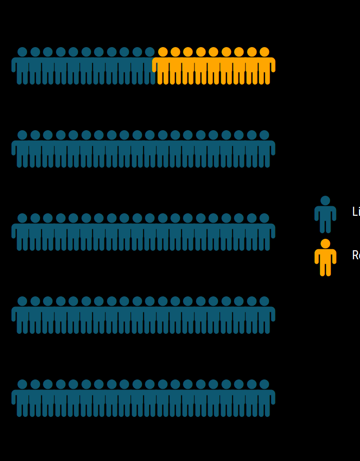
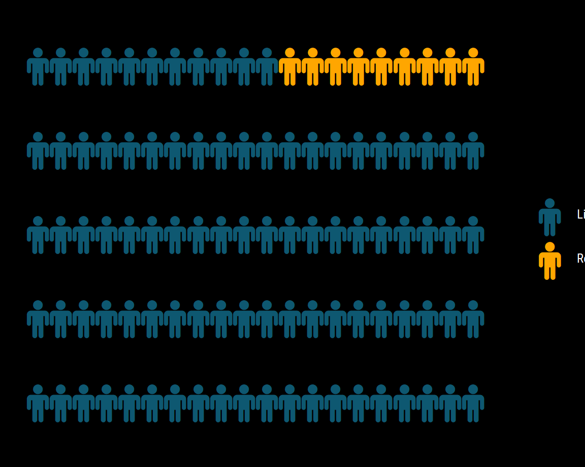
dep %>%
mutate(dep = ifelse(dep =="LIMA" | dep =="CALLAO", "Lima Metropolitana", "Otras Regiones")) %>%
group_by(dep
) %>%
dplyr::summarize(max = sum(max(pos))
) %>%
dplyr::mutate(max = round(max/sum(max)*100),
dep = as.factor(dep)
)%>%
ggplot(aes(label = dep, values = max)) +
geom_pictogram(n_rows = 20, aes(colour = dep), flip = TRUE, make_proportional = T,
family = "FontAwesome", size =10) +
scale_color_manual(
name = NULL,
values = c("#0e5871", "#ffa600"),
labels = c("Lima Metropolitana 91%", "Regiones 9%")
) +
scale_label_pictogram(
name = NULL,
values = c("male", "male"),
labels = c("Lima Metropolitana 91%", "Regiones 9%")
) +
theme_ipsum_rc(grid="") +
theme_enhance_waffle() +
theme(legend.key.height = unit(2.25, "line")) +
theme(legend.text = element_text(colour = "white"))+ theme(plot.background = element_rect(fill = "black"))+
theme(plot.margin = unit(c(0,0,0,0), "cm"))
```
### Tabla por región {.bg}
```{r}
c.dep %>%
select(Region = dep,
Casos = pos,
`Casos nuevos` = pos.new,
Fallecidos = pas,
`Fallecidos nuevos` = pas.new,
Pruebas = smp) %>%
arrange(desc(Casos))%>%
st_set_geometry(NULL) %>%
DT::datatable(options = list(
bPaginate = FALSE,
dom = 't'),
rownames = F) %>%
formatStyle(columns = c('Region', 'Casos', 'Casos nuevos', 'Fallecidos', 'Fallecidos nuevos', 'Pruebas'),
backgroundColor = 'black', color = 'white')
```
América Latina
=====================================
Column 1
-------------------------------------
### Casos Nuevos {.bg}
```{r}
plots <- lapply(vars_latam_mav, function(var) {
LATAM %>%
group_by(location) %>%
plot_ly(x = ~date, y = ~mav.pos.new)%>%
add_lines(name = "Otras regiones", hoverinfo = "none",
line = list(color = "#007e7b",
width = 0.7),
showlegend = ifelse(var == vars_latam_mav[length(vars_latam_mav)],TRUE,FALSE))%>%
filter(location == var) %>%
add_lines(text = var,
hovertemplate = paste('Fecha: %{x}',
'
Media Móvil: %{y:.2f}
',
'%{text}'),
name = ifelse(var == vars_latam_mav[length(vars_latam_mav)],"Media Móvil",var),
showlegend = ifelse(var == vars_latam_mav[length(vars_latam_mav)],TRUE,FALSE),
line = list(color = "#ffa600", width = 4)
) %>%
layout(xaxis = list(range = c(min(as.Date("2020-02-28")),
max(LATAM$date)),
color = "white"),
yaxis = list(color = "white",
title = "", type ="log", tickmode="linear",
showgrid = F, zeroline = F,
color = "#ffd29f",
range=list(1, 6),
autotick=F,
tick0=0,
fixedrange=T
),
annotations = list(text = ifelse(var=="Mexico","México",
ifelse(var=="Brazil","Brasil",
ifelse(var=="Peru","Perú",var))),
x = 0, y = 0.9,
yref = "paper",xref = "paper",
xanchor = "left",yanchor = "top",
showarrow = FALSE,
font = list(size = 16,
color = "white")),
legend = list(orientation = "h",
xanchor = "center",
yanchor = "bottom",
x = 0.5,
y = -0.125,
font = list(color = "white")))%>%
partial_bundle()
})
subplot(plots, nrows = 3, shareX = T, titleX = F,shareY=T)%>%
layout(title = list(text = "Media móvil de casos nuevos - América Latina",
font = list(size = 24,
color = "white")),
annotations = list(
list(text = "Fecha de reporte",
x = 0.5,
y = -0.09,
yref = "paper",
xref = "paper",
showarrow = FALSE,
font = list(size = 16,
color = "white")),
list(text = "Media móvil - Nuevos casos por día",
x = -0.08,
y = 0.5,
yref = "paper",
xref = "paper",
showarrow = FALSE,
font = list(size = 16,
color = "white"),
textangle = -90)),
yaxis = list(type="log", tickmode="linear")
) %>%
plotly_layout_group_2 () %>%
plotly_config(infobutton_10) %>%
plotly_end()
```
Column 2
-------------------------------------
### Todos los paises {.bg}
```{r}
LATAM %>%ungroup() %>%
dplyr::mutate(location = ifelse(location=="Mexico","México",
ifelse(location=="Brazil","Brasil",
ifelse(location=="Peru","Perú",location)))) %>% group_by(location) %>%
highlight_key(~location) %>%
plot_ly(x = ~date, y = ~mav_new, text = ~location, colors = "YlOrRd",split=~location,mode="lines") %>%
highlight(on = "plotly_hover", off = "plotly_doubleclick") %>%
layout(xaxis = list(range = c(min(as.Date("2020-02-28")),
max(LATAM$date)),
color = "white",
title ="Fecha de Reporte"),
yaxis = list(color = "white",
title = "", type ="log", tickmode="linear",
showgrid = F, zeroline = F,
color = "#ffd29f",
range=list(1, 6),
autotick=F,
tick0=0,
fixedrange=T
),
annotations = list(text = "Media móvil de nuevos casos por país",
x = -0.08, y = 0.5,
yref = "paper",xref = "paper",
xanchor = "middle",yanchor = "middle",
showarrow = FALSE,
font = list(size = 16,
color = "white"),
textangle = -90),
legend = list(orientation = "h",
xanchor = "center",
yanchor = "bottom",
x = 0.5,
y = -0.125,
font = list(color = "white"))) %>%
plotly_layout_group () %>%
plotly_config(infobutton_10) %>%
plotly_end()
```
# Acerca de
## Columna única
**Dashboard COVID-19 del Consorcio en Epidemiología y Ecología Espacial de Enfermedades**
Este dashboard y sus visualizaciones han sido diseñadas para asistir en el análisis de las tendencias que la pandemia de COVID-19 tiene en el Perú.
Última actualización: `r c.date`
+ Detalles técnicos
Se utilizó la interfaz [Rmarkdown](https://rmarkdown.rstudio.com/) y el lenguaje de programación [R](https://www.r-project.org/) para producir las visualizaciones aquí presentes.
Principales paquetes utilizados
-Tablero - [flexdashboard](https://rmarkdown.rstudio.com/flexdashboard/)
-Tablas - [DT](https://rstudio.github.io/DT/)
-Mapas - [Leaflet](https://leafletjs.com/)
-Visualizaciones interactivas - [Plotly](https://plotly.com/)
-Manipulación de datos - [tidyverse](https://www.tidyverse.org/)
+ __Fuente de datos__
Los datos de Perú provienen del [Handbook Covid-19 Perú](https://jincio.github.io/COVID_19_PERU/index.html).
Esta base de datos a sido construida utilizando los [reportes del Ministerio de Salud de Perú (MINSA)](https://covid19.minsa.gob.pe/sala_situacional.asp) a nivel nacional y regional.
Los datos de América Latina provienen de [Our World in Data](https://ourworldindata.org/coronavirus) de la [Universidad de Oxford](https://www.oxfordmartin.ox.ac.uk/global-development).
+ __Código fuente__
La documentación y código fuente se encuentran en [github](https://github.com/ce4-peru/ce4-peru.github.io).
+ __Editores y colaboradores__
-Jorge Ruiz-Cabrejos - jorge.ruiz.c@upch.pe
-Gabriel Carrasco-Escobar - gabriel.carrasco@upch.pe
-Edgar Manrique Valverde
-Alvaro Schwalb Calderón
-Ricardo Castillo neyra
-Cesar Augusto Ugarte Gil
-Claudia Arevalo
-Gian Franco Joel Condori Luna
+ __Registro de cambios__
14 de Junio de 2020 - Lanzamiento